Wednesday, December 7, 2011
What I learned in the branding project!
The branding project actually turned out to be pretty hard for me. I learned that once you come up with a design, you have to make sure that it can stand on many surface (packaging, bags, and other products). Also, you have to learn about what you are basing you design on. Look into what its all about and make sure it wont offend other cultures. Finally, I learned that you do not have to use generic colors when it comes to basing your designs off of something. For example, when your inspiration is about a smoke, you do not have to use just black, gray and white. Using colors that people dont usually associate with it will bring a good design element.
Tuesday, November 1, 2011
Bag Template
This bag design was created for two different types of wrappers. I was thinking of going with a cylinder kind of holder with cube chocolates wrapped individually. If I do not go with this idea, the candy bars will be in rectangle form. Like a hershey bar. Either idea, this bad template will work for either!
Wednesday, October 19, 2011
Converse Brand Identity.
Converse is a brand that you would reconize because of the star inside the circle. No patterns or texture are used besides the stiching. Converse are mostly aimed twords young kids but recently they are aimed twords all ages.
Wednesday, October 12, 2011
Wednesday, October 5, 2011
What I learned...
Through out this symbols project, I learned a lot of new things on Illustrator. New tools, and also new ways to use the tools I already knew about. I also learned that you do not need a lot of detail to make a big statement. By looking at your designs very carefully and eliminating un-needed detail, it will only make your design stronger.
Wednesday, September 28, 2011
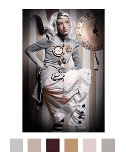
Color Palette
I chose this picture because I wanted to base this color palette of possible color choices I may use for my symbols project. Im going for a technology feel more then a fashion feel but added two different colors to give the palette a poppy feel.
Wednesday, September 21, 2011
Wednesday, September 14, 2011
Tuesday, September 6, 2011
Marian Bantjes
While looking through Marian Bantjes work, I found that I could not pick a favorite piece. Her works are very colorful and vibrant, two things that I would consider my work to also contain. I like how she works with a variety of medias and also uses many quirky lines and shapes.
Wall Paper From Scratchboard
Subscribe to:
Comments (Atom)


